
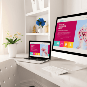
When building or refining your website, it’s often the small details that make the biggest difference. One of those subtle yet powerful elements. While it may seem minor, this tiny image plays a big role in shaping how visitors perceive your site.
In this guide, we’ll explore what a favicon is, why it matters, and how to create and implement one effectively.
What Is a Favicon?
A favicon (short for “favorite icon”) is the small graphic that appears next to your site’s title in a browser tab. It also shows up in bookmarks, search results, and mobile shortcuts. Though small in size, it serves as a visual marker for your brand and helps users recognize your site instantly among a sea of open tabs.
Think of it as your logo’s miniature twin — a bite-sized representation of your identity on the web.
Why Is It Important?
Despite its modest appearance, the favicon plays a key role in user experience and branding. Here’s why it matters:
-
Recognition: It makes your site easier to spot in browser tabs and bookmark lists.
-
Credibility: A site without a favicon can appear incomplete or less professional.
-
Consistency: It helps maintain visual consistency across different platforms and devices.
A missing or generic favicon can cause your website to fade into the background, especially when users are multitasking or revisiting saved links.
Where Do Favicons Appear?
You’ll see a favicon in more places than you might expect:
-
Browser tabs: Helps users keep track of open pages.
-
Bookmarks: Adds a visual element to saved sites.
-
Search engine results: In some cases, the icon displays next to your site name.
-
Mobile home screens: When saved to a device, it becomes the app-like icon.
By appearing in all these locations, a well-designed favicons strengthens your online presence and keeps your brand front and center.
How to Create a Favicon
Designing a favicon requires a slightly different approach than crafting a full-sized logo. Here are a few tips:
-
Keep it simple: Avoid fine details or small text — they won’t show up well at small sizes.
-
Use bold shapes: A clean, iconic shape is more likely to remain recognizable.
-
Stick with brand colors: Align the design with your existing visual identity.
-
Test it at small sizes: Make sure it looks good at 16×16 and 32×32 pixels.
Many design tools allow you to export icons in different formats like .ico, .png, or .svg. Choose the one that suits your platform best.

Recommended Sizes and Formats
For the best results, consider the following technical recommendations:
-
Sizes: 16×16, 32×32, and 48×48 pixels cover most use cases.
-
File types: Use
.icofor compatibility, or.png/.svgfor modern browsers. -
File size: Keep it under 100KB for quick loading.
Creating multiple versions in different resolutions ensures your favicon stays sharp on all devices, including high-resolution displays.

How to Add a Favicon to Your Website
Option 1: Add via HTML
If you’re editing code directly, insert the following line in your <head> tag:
Replace the file name and path if needed. Once uploaded, clear your browser cache and refresh to see the change.
Option 2: Use Your CMS
Most website platforms include a built-in option for uploading a favicon:
-
In WordPress, go to Appearance > Customize > Site Identity and upload your icon under “Site Icon.”
-
In other builders, look for a section labeled “Site Settings” or “Branding.”
No matter the platform, the process usually takes just a few clicks.
Adding a favicon to your website might feel like a minor task, but it carries lasting value. It improves your site’s visibility, reinforces your branding, and enhances the overall user experience.
With just a little effort, this small icon can have a big impact. Whether you’re launching a new site or polishing an existing one, make sure your favicon is part of the picture.
Real-World Favicon Examples That Work
A well-crafted favicon enhances your site’s visibility, reinforces your branding, and creates a sense of trust and consistency. While it may be small, its impact is anything but. Let’s look at a few standout favicon examples that show how effective design can leave a lasting impression—even in a 16×16 pixel space.
1. YouTube
YouTube’s favicon features a simple red play button icon set inside a white background. It’s instantly recognizable, clearly represents what the platform is about, and mirrors the functionality of the site itself. This design works because it uses minimalism to convey meaning while staying consistent with the platform’s overall color scheme and identity.
2. Twitter (X)
Twitter, now rebranded as X, has transitioned to a sleek, black-and-white “X” favicon. This sharp design keeps things modern and bold. Its high contrast makes it easy to spot among browser tabs, and the simplicity of the shape reflects the brand’s shift toward a more minimalist and tech-forward image.
3. Instagram
Instagram uses a simplified version of its colorful gradient camera icon. Even without intricate detail, the gradient color palette is enough to make it instantly familiar. It’s a great example of how color and shape can be used effectively to represent a brand at a small scale.
4. LinkedIn
LinkedIn’s favicon features a lowercase “in” in white set against a blue background. It’s direct, clean, and well-aligned with the platform’s professional tone. The compact design ensures legibility while reinforcing the brand’s well-known color scheme and typography.
5. Adobe
Adobe’s favicon typically showcases the letter “A” in a stylized format using red and white. The geometric shape is sharp, minimal, and consistent with the company’s design-oriented brand. It’s a good example of how a single letter can stand in for a larger logo while maintaining strong brand recognition.
What We Can Learn from These Examples
Each of these favicons succeeds because it focuses on clarity, alignment with brand identity, and simplicity. Whether using a single letter, an abstract symbol, or a simplified version of a logo, the most effective favicons:
-
Are easily recognizable even at a small size
-
Use consistent colors and shapes that reflect the brand
-
Maintain visual clarity across different backgrounds and devices
Conclusion
Although it takes up just a tiny space, your favicon contributes to how users perceive your site and interact with it. A thoughtful, well-designed icon helps your website look polished, professional, and easier to find among open tabs or saved bookmarks. It’s a finishing touch that quietly reinforces your brand every time someone visits.