
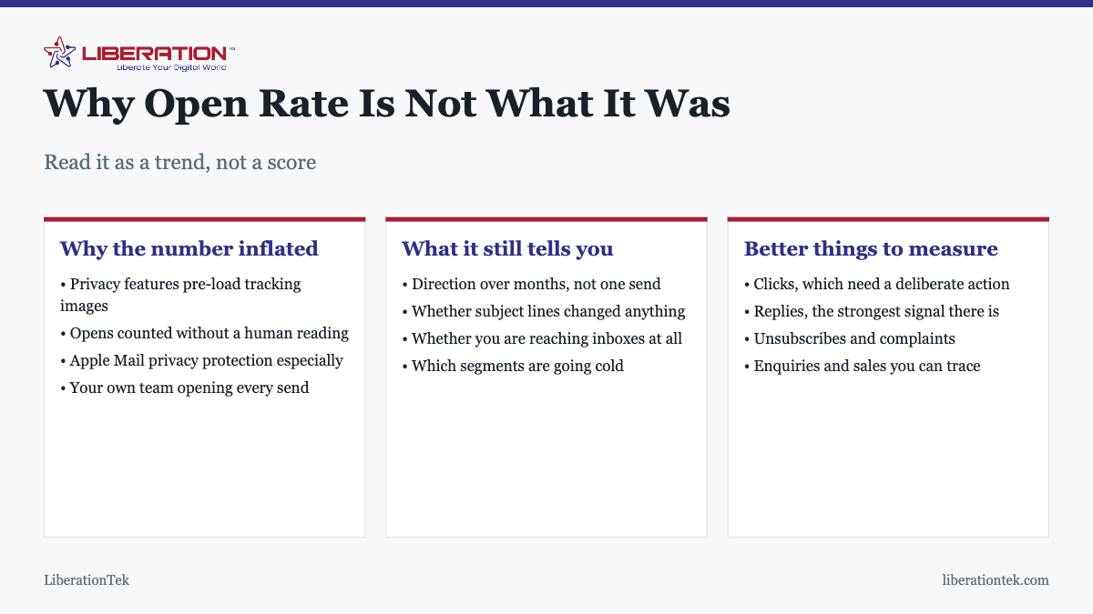
A Good Email Open Rate is no longer a reliable benchmark for a good email open rate. Privacy features pre-load tracking images and register opens no human performed, which inflates the number for everyone by an unknown amount. Read your own trend over months rather than comparing one send to a published figure, and use clicks as the real measure.
Good Email Open Rate – this was never a precise metric, but it used to be roughly honest. It is now measuring something closer to how many of your recipients happen to use particular mail apps, which is not a fact about your email at all. That matters because open rate is still the number most small businesses look at first, and still the one most often used to decide whether an email program is working.
How the measurement works, and why it broke
An open is recorded by embedding a tiny invisible image in the email. When a mail client loads that image, the platform registers an open. That was always approximate: text-only readers and people with images blocked read messages without ever counting.
What changed is the opposite failure. Privacy features now fetch remote images automatically, in advance, without the recipient doing anything. Apple Mail Privacy Protection is the most widely used, and several other providers and corporate filters do similar. The image loads, an open is recorded, and nobody has read anything.
The result is a number inflated by an amount you cannot determine, because it depends on which mail clients your particular subscribers happen to use. Two lists with identical real engagement can report very different open rates.
Why benchmarks are worse than useless now
Published industry benchmarks carry the same inflation, and they were already unreliable for other reasons:
- Industry averages hide enormous variation. A list of recent customers and a list of cold contacts in the same sector behave nothing alike.
- List age and quality dominate. These matter far more than industry, and benchmarks do not account for them.
- Self-reported data skews high. Benchmarks drawn from platform customers exclude the worst performers.
- Everyone is inflated differently. The distortion is not uniform, so comparison is meaningless even in principle.
Comparing your number to a benchmark and drawing a conclusion is the specific mistake worth avoiding. There is no score to hit.
What the number is still good for
It retains value as a trend on your own list, where the distortion is at least roughly constant:
| Pattern | Likely meaning |
|---|---|
| Steady decline over months | Engagement falling, or inbox placement worsening |
| Sudden drop on one send | Subject line, timing, or a deliverability problem |
| Sudden drop across all sends | Authentication or reputation issue; investigate promptly |
| Step change upward with no cause | Usually a privacy feature, not an improvement |
| One segment far below the rest | That segment is going cold |
A sudden drop across every send is the one to act on quickly, because it often means mail has stopped reaching inboxes rather than that people stopped caring. The diagnostic sequence is in why emails go to spam.
What to measure instead
- Clicks. A human decided to act. No privacy feature clicks a link. This is the closest thing to a reliable engagement measure you have.
- Replies. The strongest signal available, both for you and for the providers assessing your reputation. Send from an address that accepts replies rather than a noreply.
- Unsubscribes. Honest and immediate. A rise says something specific went wrong.
- Complaints. The most important number on this list. Watch it closely; it damages deliverability faster than anything else.
- Enquiries and sales traceable to a send. The only metric that is actually about your business rather than about email.
A high open rate with almost no clicks is a common and informative pattern: the subject line worked and the content did not deliver what it implied. That is a useful diagnosis, and it is only visible if you are looking at both. The reverse pattern, modest opens with strong clicks, usually means you are reaching a smaller audience than you think but reaching the right part of it.
Segmenting before you judge the number
A single figure for the whole list averages together groups that behave nothing alike, and the average then describes none of them. Before concluding anything, it is worth splitting the report at least once:
- By how recently someone subscribed. People who joined in the last month engage far more than those who joined two years ago. A list with steady growth will show a slowly declining overall figure purely because the older cohort grows, even when every individual cohort is healthy.
- By customer versus prospect. These almost always differ sharply, and a change in the mix will move your headline number without anything about your emails changing.
- By how they joined. Signups from your own content behave differently from checkout opt-ins. If one source consistently produces contacts who never engage, that is worth knowing about the source rather than about the emails.
This is also how you spot a segment going cold early enough to do something about it, rather than discovering it when the overall figure has been sliding for six months.
The engagement point that does matter
Although the reported figure is unreliable, genuine engagement is not irrelevant. Mailbox providers observe real behavior, including things your platform cannot see, and mail that is consistently ignored gradually receives worse inbox placement.
This is the practical argument for removing contacts who never engage rather than keeping them to make the list look larger. It improves your reported figures, but more importantly it improves delivery for everyone still on the list. The same logic applies to frequency, covered in how often to send marketing emails, and to how the list was assembled in the first place, in how to build an email list.
A sensible way to read your reports
- Compare against your own history, never against a benchmark.
- Look at several sends together. One campaign is noise.
- Lead with clicks, and treat opens as supporting context.
- Watch complaints and unsubscribes as the health indicators they are.
- Investigate sharp changes, in either direction, rather than celebrating or despairing.
- Tie it back to enquiries where you can. That is the number your business actually runs on.
If none of your emails are reaching inboxes, no metric will help, so it is worth confirming the foundations are right first: correct SPF, DKIM and DMARC records matter more to results than any subject line.
Frequently asked questions
What is a good email open rate?
There is no reliable universal figure any more, because privacy features pre-load tracking images and register opens no human performed. Published benchmarks are inflated by this and vary enormously by industry and list quality anyway. Your own trend over several months is the only number that means anything, and clicks are the better measure.
Why is my open rate suddenly higher than it used to be?
Almost certainly privacy protection rather than better emails. Apple Mail Privacy Protection and similar features fetch tracking images automatically whether or not anyone reads the message, which registers as an open. Many senders saw a step change in reported open rates when those features arrived, with no change in actual engagement.
Is open rate still worth tracking at all?
As a trend, yes. A steady decline over months is a genuine signal that engagement is falling or that inbox placement is worsening. A single send being above or below a benchmark tells you very little. Track the direction, not the score, and never make decisions on one campaign.
What should I measure instead of open rate?
Clicks, replies, unsubscribes, complaints, and enquiries or sales you can trace back to a send. Clicks require someone to decide to act, so they cannot be triggered by a privacy feature. Replies are the strongest engagement signal of all and are worth encouraging by sending from a monitored address.
What is a good email click rate?
Like open rate, benchmarks vary widely, but click rate is at least measuring a real human decision. The useful comparison is your own history: whether a given email beat your typical performance. A high open rate with low clicks usually means the subject line promised something the content did not deliver.
Does a low open rate hurt deliverability?
Low genuine engagement does, over time, because providers notice mail that is consistently ignored and gradually adjust inbox placement. The reported open rate in your dashboard is not what they measure. This is another reason to remove contacts who never engage rather than keeping them for the headline number.
Should I resend to people who did not open?
Cautiously, and not automatically. Resending to non-openers is a common tactic, but since the open data is unreliable you may be mailing people who did read it. If you do resend, change the subject line, leave a gap of several days, and exclude anyone who clicked. Frequent resending raises complaints.
Related reading
- The Best 2026 Marketing Campaign Tips for Growing Brands
- Private Email Providers Compared: Liberation Email vs. Tuta, StartMail More
- Choosing the Best Conservative Email Marketing Software
- What Is a Professional Email Address? (And How to Set One Up)
- Secure Alternatives to Traditional Email